Building an AI-assisted Product Brand
Naming, branding, and launching a new stewardship platform for JSTOR
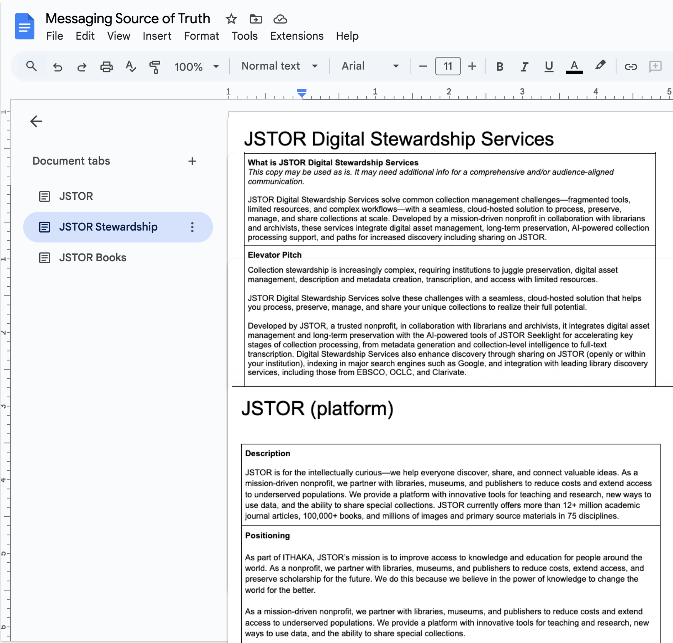
JSTOR is known around the world for its academic research platform—but it struggled to be recognized as a leader in digital collection management until we launched the AI-assisted Digital Stewardship Services offering.
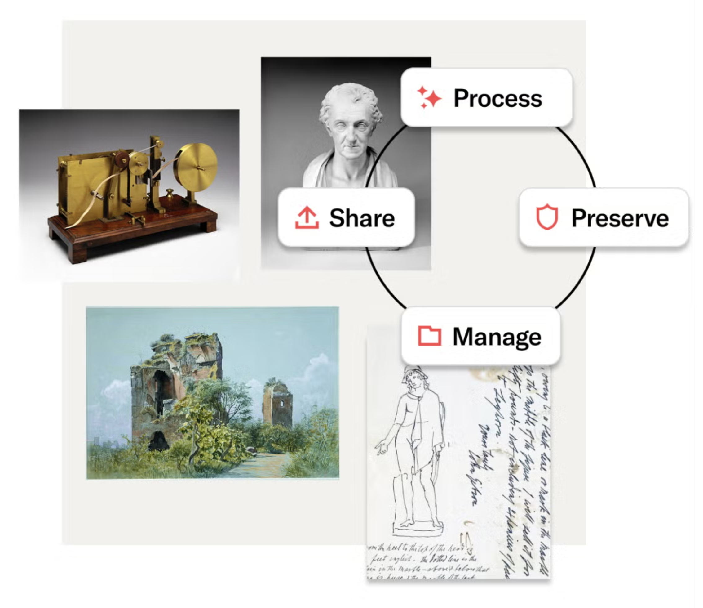
Enabled by the AI-powered technology of JSTOR Seeklight, Digital Stewardship Services is a seamless, cloud-hosted platform that helps you process, manage, preserve, and share collections.
300+ participating institutions worldwide
13+ million items processed, preserved, managed, and shared
The redesign serves various audiences and their needs through user stories. Some examples are:
As an Instructional Librarian, I want to see new research materials to support educators and students so that I can allocate my budget to best support student success.
As a Special Collections Librarian, I need to describe, manage, and safely post our institution's special collections of scholarly materials so that they are shared and discovered by the researchers.
As an Educator, I need to direct my students to a reliable and tech-forward research platform for teaching and learning so that I can support and student success.
As a Student/Researcher, I need access to primary and secondary source materials specific to my area of research so that I can achieve my academic goals.
The Website & Branding Refresh
Goals and results
Brand refresh: Position JSTOR as the premier research platform for humanities, arts, and social sciences as well as the best nonprofit solution for digital material stewardship.
A tech-forward presentation for a seamless JSTOR offering—from the research platform to the AI-assisted digital stewardship product.
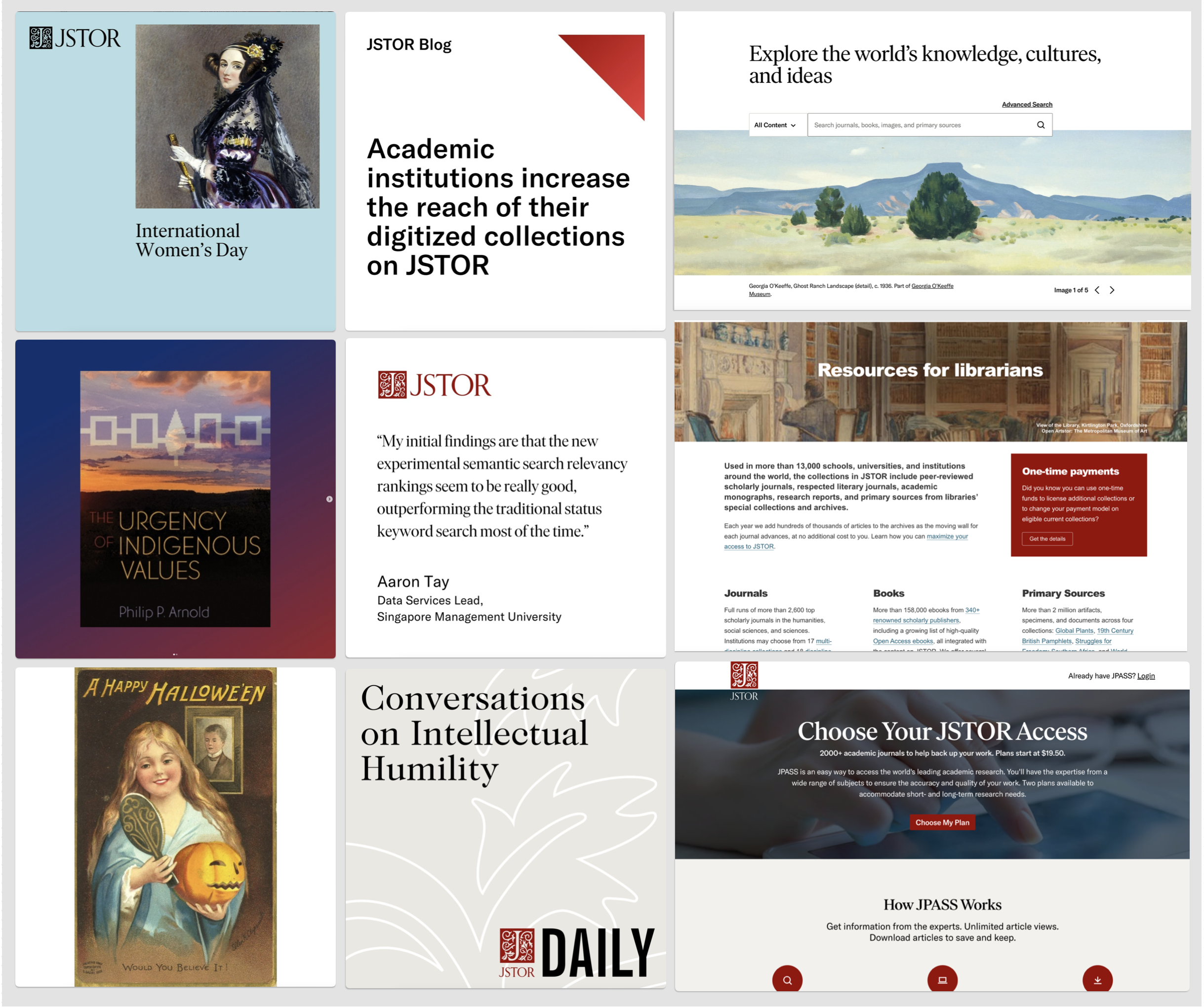
Pseudo UI imagery communicates the user experience and overall benefits.
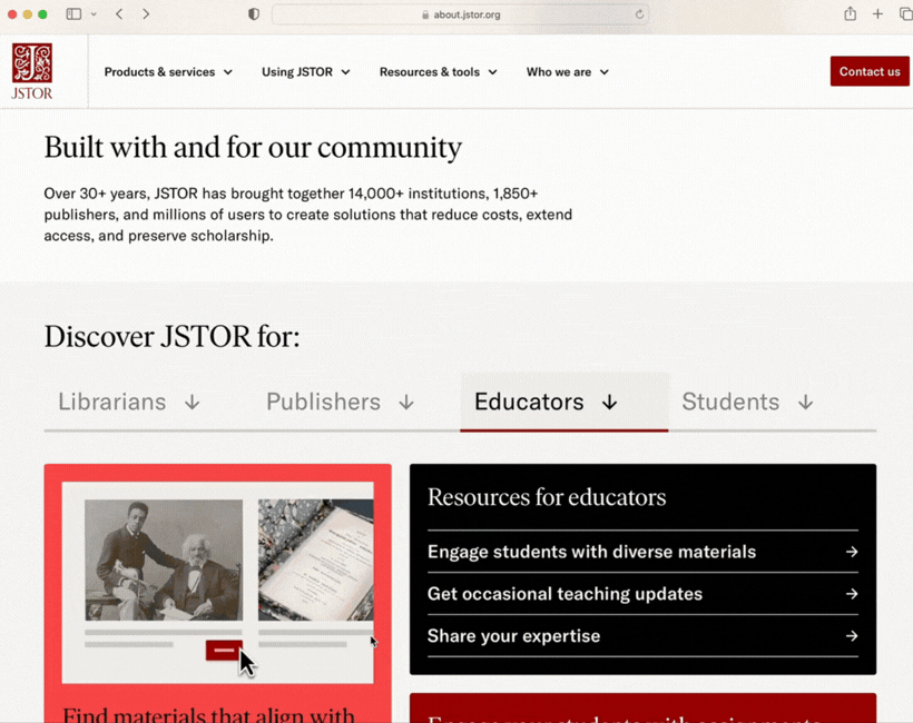
Website UX: Use human-centered design and user stories to create a focused experience that clearly communicates relevant information for each visitor.
Improve time on site, page views per session, and form completions.
Allow self-identification for intuitive user flow to role-specific resources.
Clear communication: Text prioritizes top takeaways in easy-to-scan formats. Images work with text to communicate details in memorable ways.
Efficiency for ongoing execution: Bridge brand expression across marketing and product experiences. Provide design system libraries, messaging guides, tools, and templates.
Designers and writers (and non-designers and non-writers) have the tools to quickly contribute to the website with on-brand imagery and copywriting.
My Role
I led the brand refresh and co-led the website redesign. For both projects, I provided branding and creative direction for designers and writers and focused the build on our audiences and their needs through user stories.
The Teams
Brand refresh: Marketing leadership, brand and creative direction for designers and writers (me), copywriters, graphic designers, and motion designers
Website design: Marketing leadership, brand and creative direction for designers and writers (me), digital marketing lead, marketing enablement lead, external design agency, internal copywriters, and visual designers
Step 1. Understanding our old and new audiences
We already had existing personas for the JSTOR scholarly content platform, including librarians, publishers, educators, and students.
Next, we needed to better understand our audience for the new Digital Stewardship product offering. To do so, we used results from qualitative interviews, quantitative surveys, and a proprietary study of hundreds of practitioners to inform new personas and user stories.
This more in-depth understanding of our audiences guided the brand and website redesign.
Step 2. Audit the old brand
We audited the existing brand elements and assessed them against our redesign goals and relative return on investment. We focused on where we could make the biggest impact to make the brand more memorable, more modern, and more relevant for our audiences’ needs.
Step 3. Revise brand elements
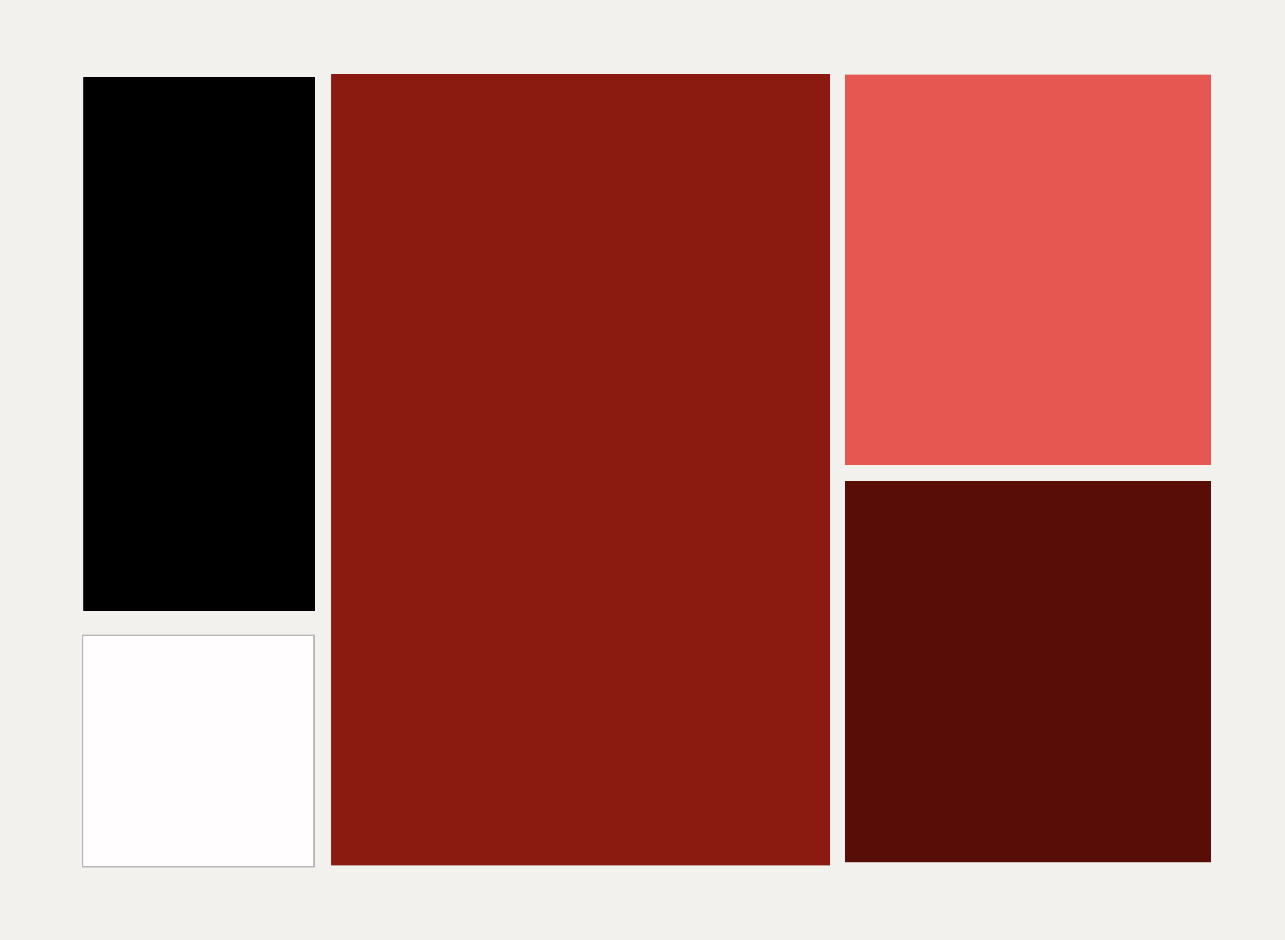
JSTOR is a red brand, but the brand palette included too many distracting colors. So we doubled down on red with two new shades to add to the palette and removed the icy blue.
The existing typography was created for dense information, which is great for the research platform but not welcoming in digital marketing. We revised the use of the existing fonts by adding larger sizes, more letter spacing, line height, and an expressive use of italics.
Step 4. Create Messaging
We created Messaging Frameworks to help writers consistently expedite downstream content and copywriting. The short- and long-form message options convey the value we deliver relevant to our various personas.
Research shows people scan instead of reading text on screens, and we retain few messages. Our messaging puts the key-takeaway at the top. The copy is short and to the point, showing we value the reader’s time and attention.
Step 5. Create, document, and publish easy to use systems
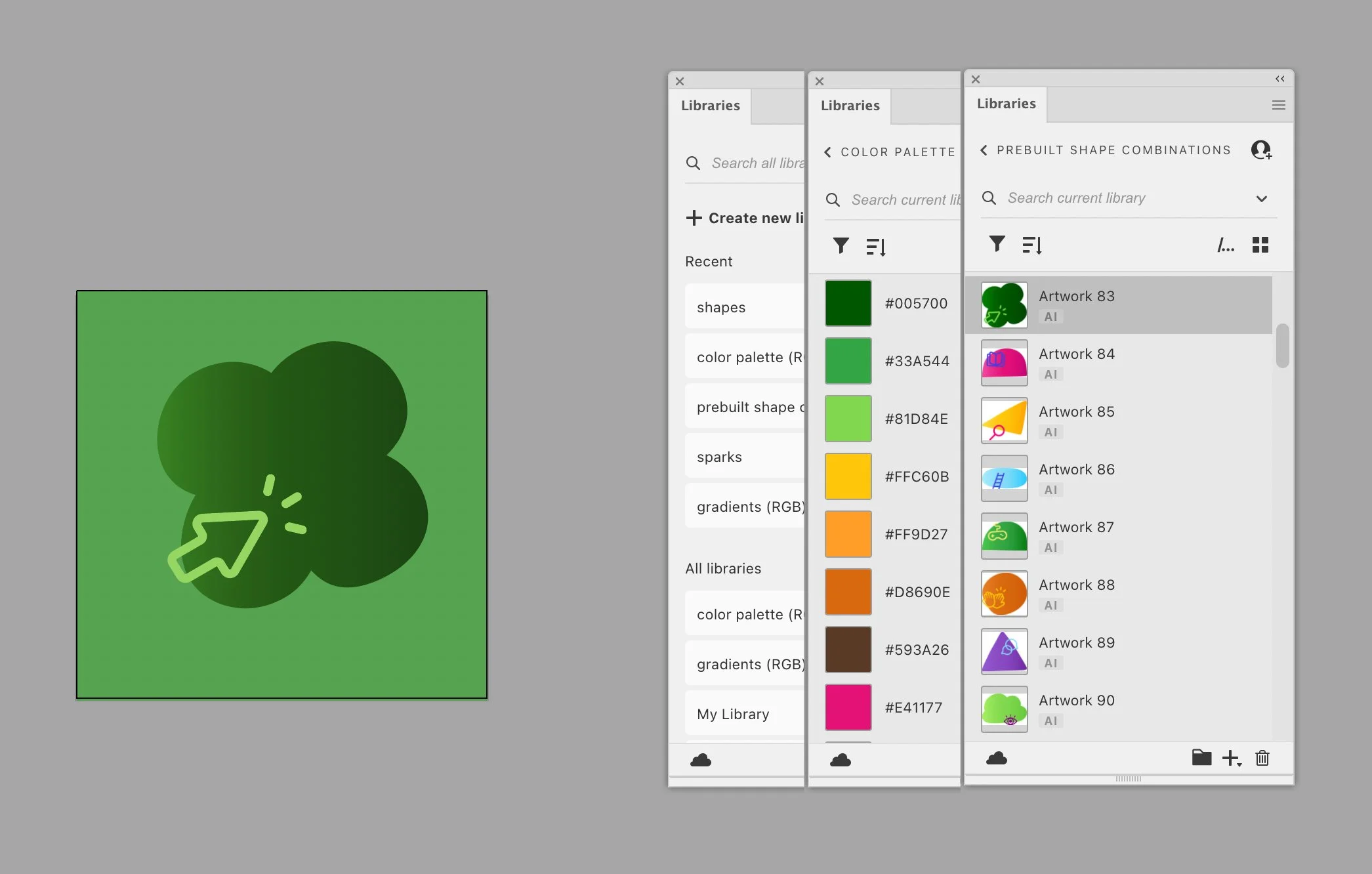
The brand libraries are in Figma, Adobe CC, and Canva. Easy-to-use templates for non designers are in Canva and Google Slides.
Related Style Guide
The Common Kit: Atomic Product Design Guidelines
Goals
Create living guidelines for designers and developers
Improve speed and efficiency for design and development
Ensure consistency across digital experiences
Reduce design and tech debt
Maintain brand integrity
Results
Improved speed and efficiency for design and development
Consistent digital experiences
Greatly reduced design and tech debt
Elevated brand integrity
My role
Help ensure resources and time are committed to the ongoing project, oversee product designers, and UX copywriter
Team
VP of Product; VP Brand and Design (me); Sr. product designer and project leader; product designer, developers; UX copywriter; and product manager

The Common Kit design system for Common Sense Media is a central, shared repository for front-end patterns and code. With it designers and developers can ensure consistency across digital experiences and maintain brand integrity. The Common Kit is based on our design principles (see below).
For designers, it is a living, breathing document that describes many of our visual assets (components, iconography, color palettes, grids, etc.) and the guidelines for use. For developers, it provides a library of reusable, extendable, styled components to build websites and user interfaces. Adopting the library enables developers to use consistent markup, styles, and behavior in prototype and production work.
The Common Sense Design Principles are derived from our users' needs, our brand position, and our mission. They provide a framework for collaboration and shape our decisions as we create, iterate, and refine our products. They help us strive for high quality experiences for our users.
We design to build trust. Our independent, unbiased products, reviews, and advice are grounded in research. We protect user privacy. We champion user needs.
We welcome everyone. We believe interface design, copy, and functionality should facilitate user-performance for everyone regardless of abilities, education, and socio-economic background.
We empower users to make the best choices for kids. Our design systems should highlight subject matter in a way that enables users to explore and discover what's right for them.